Brand
Guide
This document defines the visual and verbal identity of Loupe Digital. It exists to ensure clarity, consistency, and purpose across every touchpoint.
Logo & Icon
The Loupe logo consists of two elements: the icon (two arcs forming a circle — a magnifying loupe) and the wordmark ("loupe®"). Together they represent clarity, precision, and insight. They may be used separately or combined, depending on context.
Icon anatomy
The icon is a circle composed of two distinct arcs. The Orchid Purple arc (smooth, ~270°) represents structure and intelligence. The Light Orange dashed arc (~90°) represents action, momentum, and the data signal cutting through. Neither arc should be used without the other.
Logo variations
Clear space & minimum size
Always maintain a minimum clear space equal to the diameter of the icon circle around the full logo. Minimum digital size: 120px wide for the full logo. 24px for the icon alone.
Colour Palette
The palette is bold, purposeful, and data-driven. Prussian Blue anchors the brand with authority. Cobalt Blue brings digital energy. The two oranges inject warmth and action. Orchid Purple adds creative depth — reserved for gradients and accent moments.
Primary accent — CTA, highlights
Hover states, urgency
Icon arc, gradients
Digital surfaces, cards
Primary background & text
Supporting & neutral tones
Colour usage rules
Primary combination — Dark sections
Prussian Blue or Cobalt Blue backgrounds with white text. Orange is used for CTAs and labels only — never as a large background colour.
Primary combination — Light sections
Off-white or white backgrounds, Prussian Blue text, orange for accents and interactive elements. Mid-blue for body copy.
Gradient sections
Prussian Blue to Orchid Purple gradients are used for chapter dividers, impactful hero moments, and accent sections. Avoid overuse.
Orange usage
Orange is exclusively an accent — never a dominant background. Use for CTAs, eyebrows, icon arcs, data highlights, and hover states.
Typography
Loupe Digital uses Montserrat exclusively. It is clean, geometric, and authoritative — matching the brand's data-driven confidence. Weight variation does all the heavy lifting: ExtraBold/Black for impact, Regular/Light for readability.
Brand Voice
Loupe Digital speaks like a brilliant colleague — not a vendor. The voice is direct, evidence-based, and confident without being arrogant. We don't use jargon to impress; we use clarity to build trust.
Precise, not vague
We speak in specifics. Numbers, outcomes, and named mechanisms — not buzzwords or empty promises.
Confident, not boastful
Loupe is sure of its expertise — but earns authority through insight, not self-promotion.
Partner, not vendor
We embed with teams. We share the problem before we propose the solution. We use "we" when it's warranted.
Clear, not complex
Data is complex — we make it legible. Short sentences. Active voice. One idea per paragraph.
Systematic, not tactical
We talk about systems and loops, not one-off campaigns. The frame is always: interconnected, compounding, measurable.
Evidence-first
Opinions are backed by data. Recommendations come with rationale. We never guess — we measure.
Approved taglines & phrases
These lines have been crafted and approved for use across all brand touchpoints.
Brand in Use
How the Loupe Digital brand appears across digital and print touchpoints. Consistency across all applications reinforces trust and recognition.
Presentation cover
Prussian→Cobalt gradient · White logo · Concentric arc background · 16:9
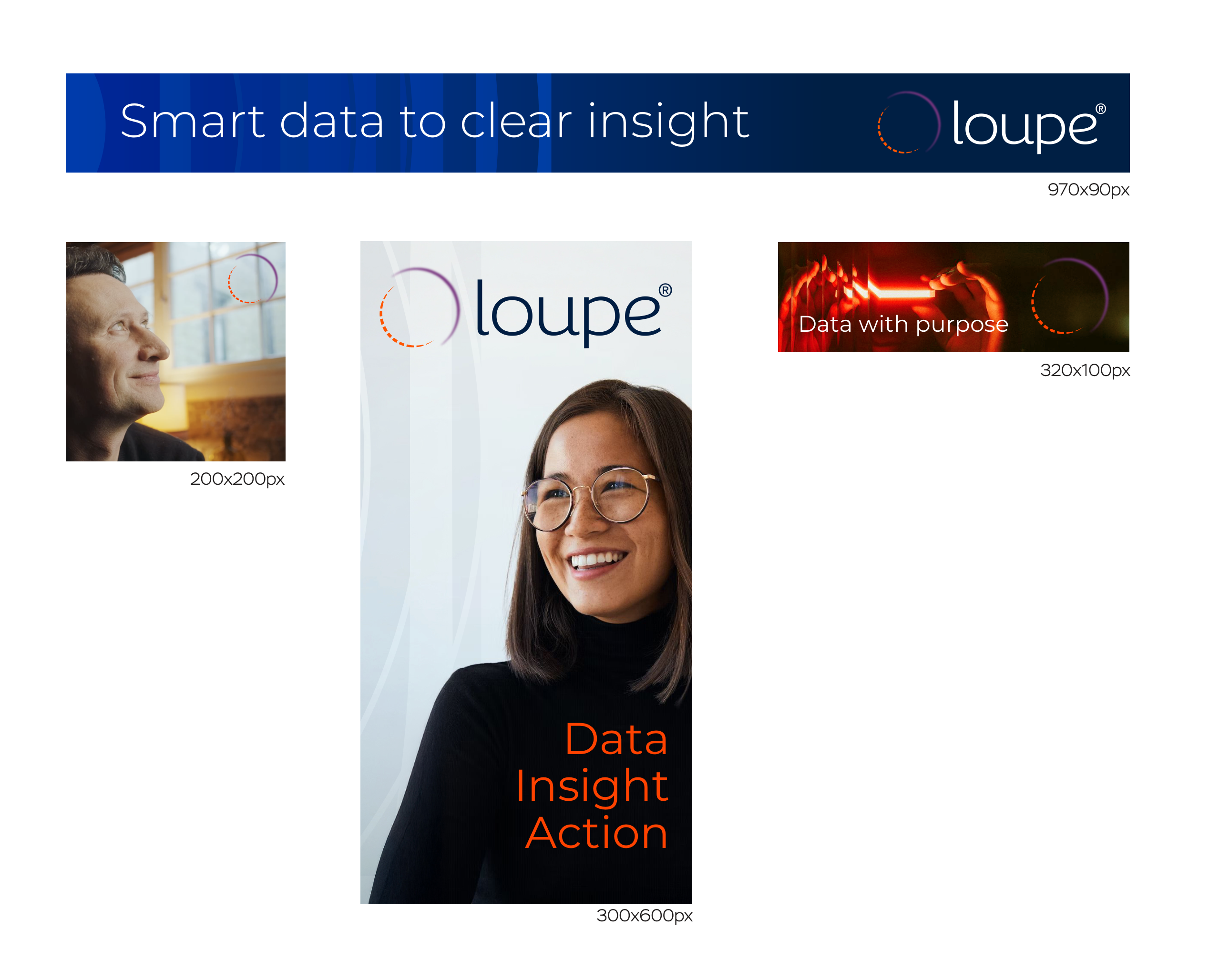
Digital banners
970×90, 320×100, 300×600, 200×200 · Dark backgrounds · Orange CTA text
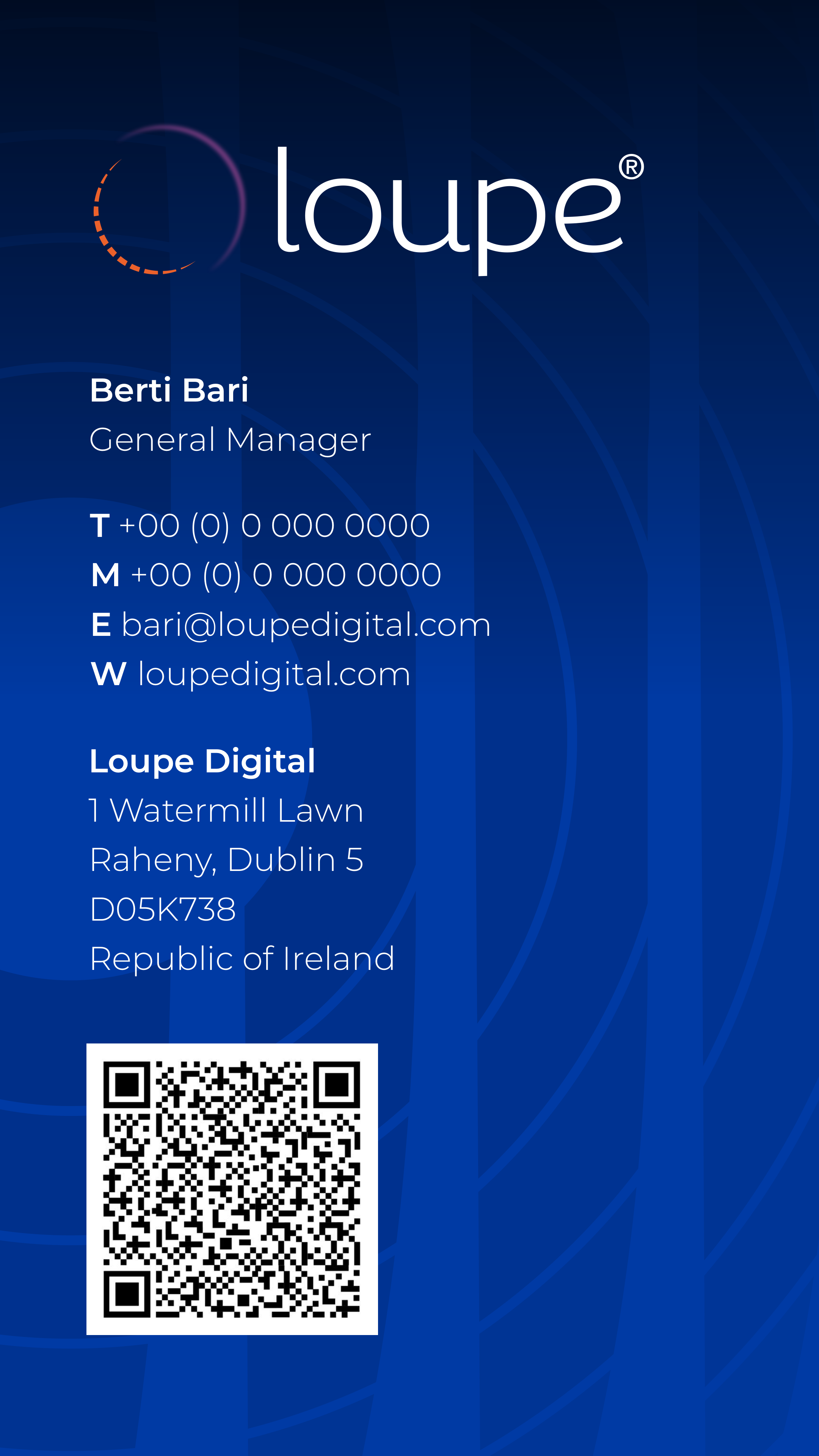
Business card
Front: Prussian Blue + logo + concentric arcs · Back: White + orange accent line · Contact info
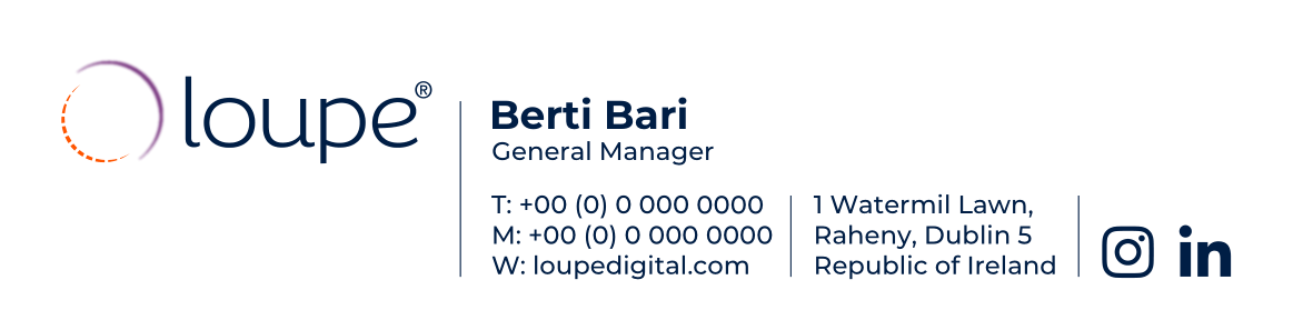
Email signature
White background · Orange top border · Logo + name · Role in orange · Contact details
Social Posts
Branded square-format posts using photography with subtle typographic overlays. The Loupe icon appears in the top-right corner as a consistent brand signature.

"Data with purpose"

"Smart data to clear insight"

"Data. Insight. Action."
Do's & Don'ts
These rules protect the integrity of the Loupe Digital brand. When in doubt, refer to this guide or contact the brand team before proceeding.
Don't rotate or skew the logo. It must always appear upright and undistorted.
Don't place the full-colour logo on an orange background. The purple arc disappears and the wordmark loses contrast.
loupe®
Don't swap the arc colours. The purple arc is always continuous; the orange arc is always dashed.
Don't use orange as the primary text colour for long-form copy. It is for accents, labels, and CTAs only.
Don't use orange as a large background colour for sections or cards. It should never dominate a layout.
Don't use alternative fonts (Arial, Roboto, Helvetica). Montserrat is the only approved typeface for all brand communications.
Quick reference — Do's
Use white or full-colour logo on approved backgrounds only (Prussian Blue, Cobalt Blue, white, off-white).
Use concentric circles as a background motif at 10–20% opacity — never as a foreground element.
Use Montserrat 800–900 weight for headings, 400 for body, 700 uppercase for labels and eyebrows.
Use orange (#ff8100) exclusively for: CTAs, eyebrow labels, the icon arc, data highlights, and hover states.
Maintain a minimum clear space equal to the icon circle diameter around the full logo at all times.
Speak in specifics: use data, outcomes, and named mechanisms. Avoid jargon and vague promises.
1 Watermill Lawn, Raheny, Dublin 5 · loupedigital.com